Eleven years in the making. I am seriously damn proud of myself.

Eleven years in the making. I am seriously damn proud of myself.
Augh! My work finally blocked my blog, under the category of Personal Blogs and Websites. I knew the day would come.
In addition to documenting these delicious reasons my boss is awesome, I also enjoy capturing these stealth upside-down reflection portraits of my co-workers. Hi, N! Hey, S!
It’s 8:30am and I’m the 1st one at work in my department. Four of the nine are on vacation today, so the others must be either working from home today or running later than me. 🙂

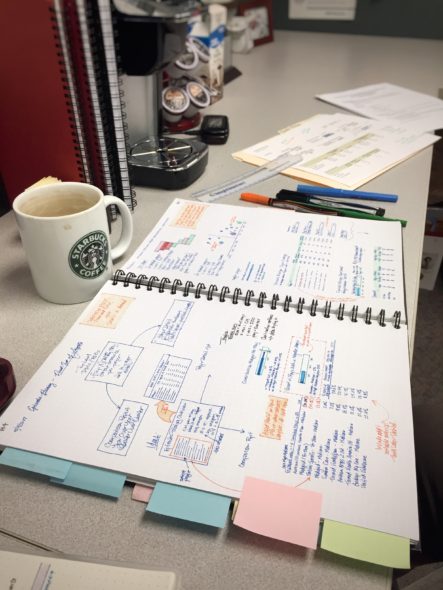
I both live for and dread the beginning of a project.
It’s my favorite part because I get to do what I do best: arrange data into meaningful and useful tools for end users. It’s my least favorite because I rarely feel like I’m going into the design phase with enough information about the process I’m supposed to be improving. What will this tool be used for, and by whom? How do they do it now?
I’ve been trying to expand my skills in data visualization and analysis lately, so this project I’m working on now is more frustrating to me than usual. First, I’ve finally realized that the way our development process works is not conducive to properly sitting with the data like actual dataviz people do — but, to be fair, I’m not actually in data visualization. I’m in the Data Warehouse, and I design dashboards. I’m not making infographics for the Wall Street Journal; I’m making enterprise dashboards for my company.
(And, no, they’re not the NCC-1701-D type, either. Enterprise just means company-wide in this context.)
Anyway.
I guess one of the most frustrating things is that I’m learning all about these visualization and dashboarding tools that other companies use, but we don’t. I’ve learned to bend SQL Server Reporting Services (SSRS) to my will as much as I can, but it’s still not a dashboarding or data exploration tool. It’s for reporting, period.
They say that when all you have is a hammer, everything looks like a nail. To me, that’s true, to an extent… except I’m also trying to figure out non-standard ways to wield the hammer.
There’s also the small issue of the reporting audience. I could suggest a bullet graph, maybe even get the stakeholders to agree to it… but unless it was accompanied with text on how to interpret it, I’m not sure it would fly. I’m supposed to be creating visuals that help people do their jobs better, and in my mind, that’s best served by providing (and enhancing) visualizations they’re already familiar with… even if an unfamiliar one would be more efficient.
It’s such a delicate balance.
So, yeah. I love this part… and I hate this part.